
Craig Dalton Osteopathy
WEBSITE REFRESH
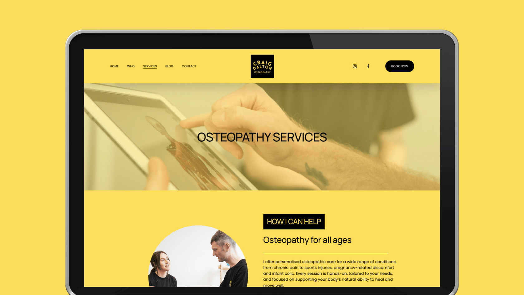
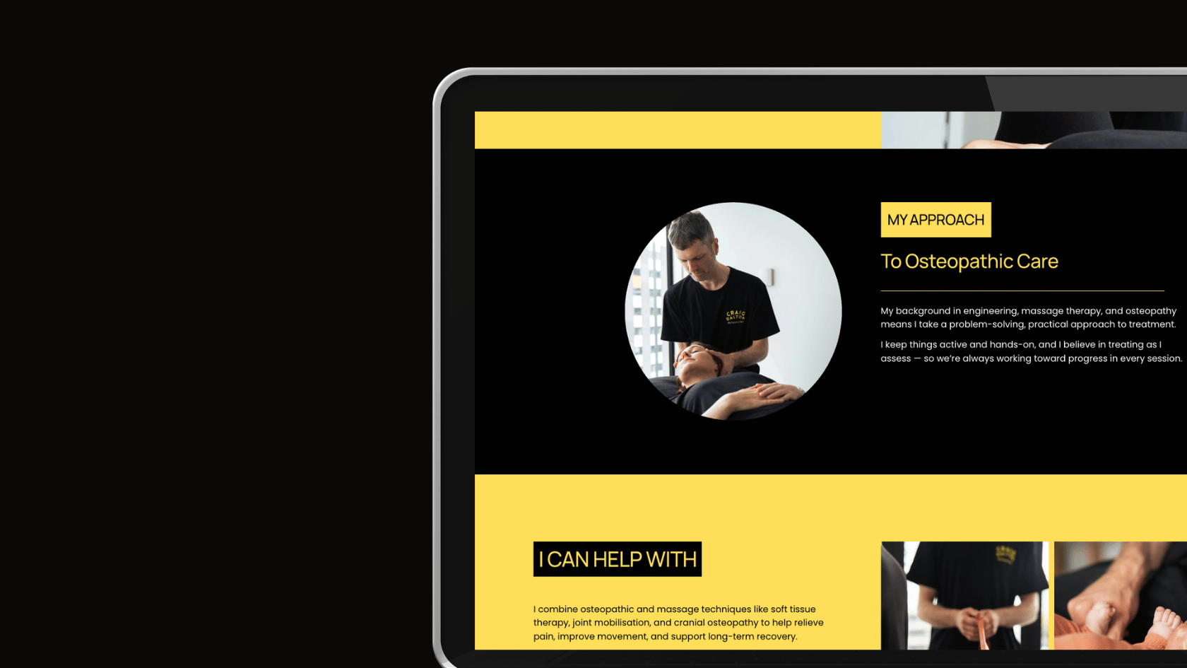
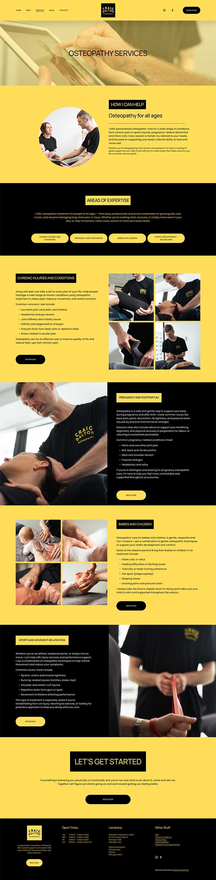
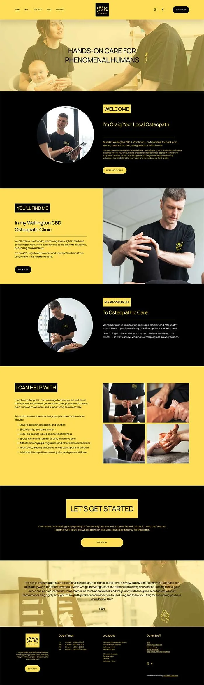
Craig originally built his own website, but like many DIY builds, the structure was not quite right and the key information patients needed was missing or hard to find. He had a clear idea of the style he wanted, including a very specific brief that no backgrounds were to be white and the entire site had to use only his signature yellow and black colour palette. My job was to take that vision and elevate it.
I rebuilt every page from the ground up, reshaping the structure so it was user friendly, clear and logical while still honouring his bold brand look. I kept the essence of what Craig was aiming for but refined and improved the design to make it feel more polished and professional. I also rewrote all of the content to clearly communicate his services, background and approach to osteopathy.
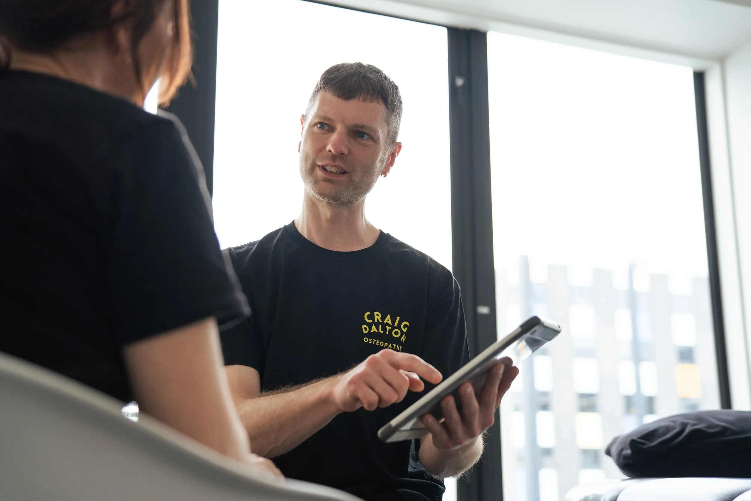
Craig also invested in a professional photo shoot, which made a huge difference to the final website. The new imagery brought everything together and gave the site warmth, clarity and personality, helping the strong colour palette feel balanced and approachable.
A full redesign that kept his original creative direction but transformed it into a clean, modern and functional website aligned with how he works as a practitioner.
Words from the client
“I contacted Jodi for a website refresh and restructure, and was really impressed with how quickly she responded and understood what I needed. I appreciated her professional insight and the pushback when we were refining ideas. The end result is a much better-structured website, and my Google rankings have improved significantly. Highly recommend Jodi for Squarespace users!”
CRAIG DALTON - OSTEOPATH
Colour Palette
Like what you see?
If you like this website design then let’s chat about how I made it happen.