
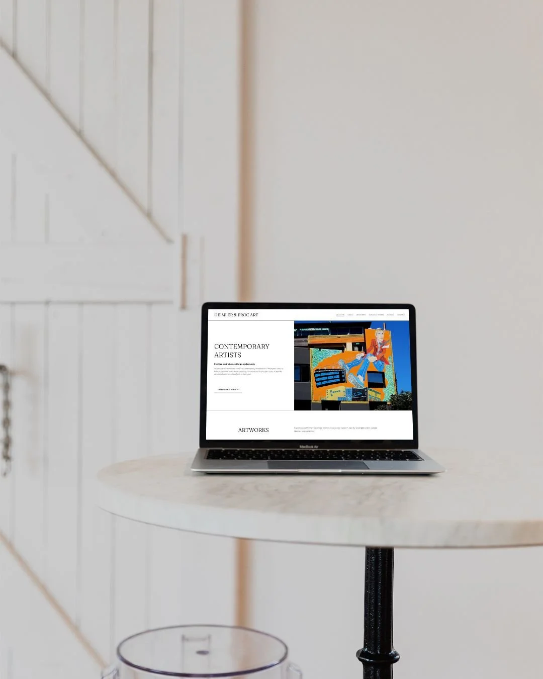
Heimler and Proc
WEBSITE REDESIGN AND RESTRUCTURE
Artists Anna Heimler and Gabriel Proc had a huge body of work online, built up over many years. Their existing website had grown alongside their practice, with new paintings, murals, exhibitions, projects, press and archive material added over time.
The biggest challenge wasn’t the design. Before I could restructure the website, I had to properly understand their work.
There was a lot to get my head around. Different periods of work, individual projects, exhibitions, murals, paintings created in Berlin and New Zealand, private collections, available works and older archive material. I needed to understand what belonged together, the chronology of their work, which pieces or projects were particularly significant, and how Anna and Gabriel themselves thought about their practice.
Only then could I work out how somebody completely new to Heimler & Proc should experience it online.
The old website had lots of dropdowns, standalone pages containing very little content, inconsistent page names and some wonderfully random URLs, including the likes of “page-84”. There was a huge amount of interesting material there, but no obvious journey through it.
Once I understood the content, I could start rebuilding the structure around it. What belonged together? What deserved its own page? What could become part of a gallery? What should live in the archive? And what new landing pages were needed at the top level to help visitors understand where to go next?
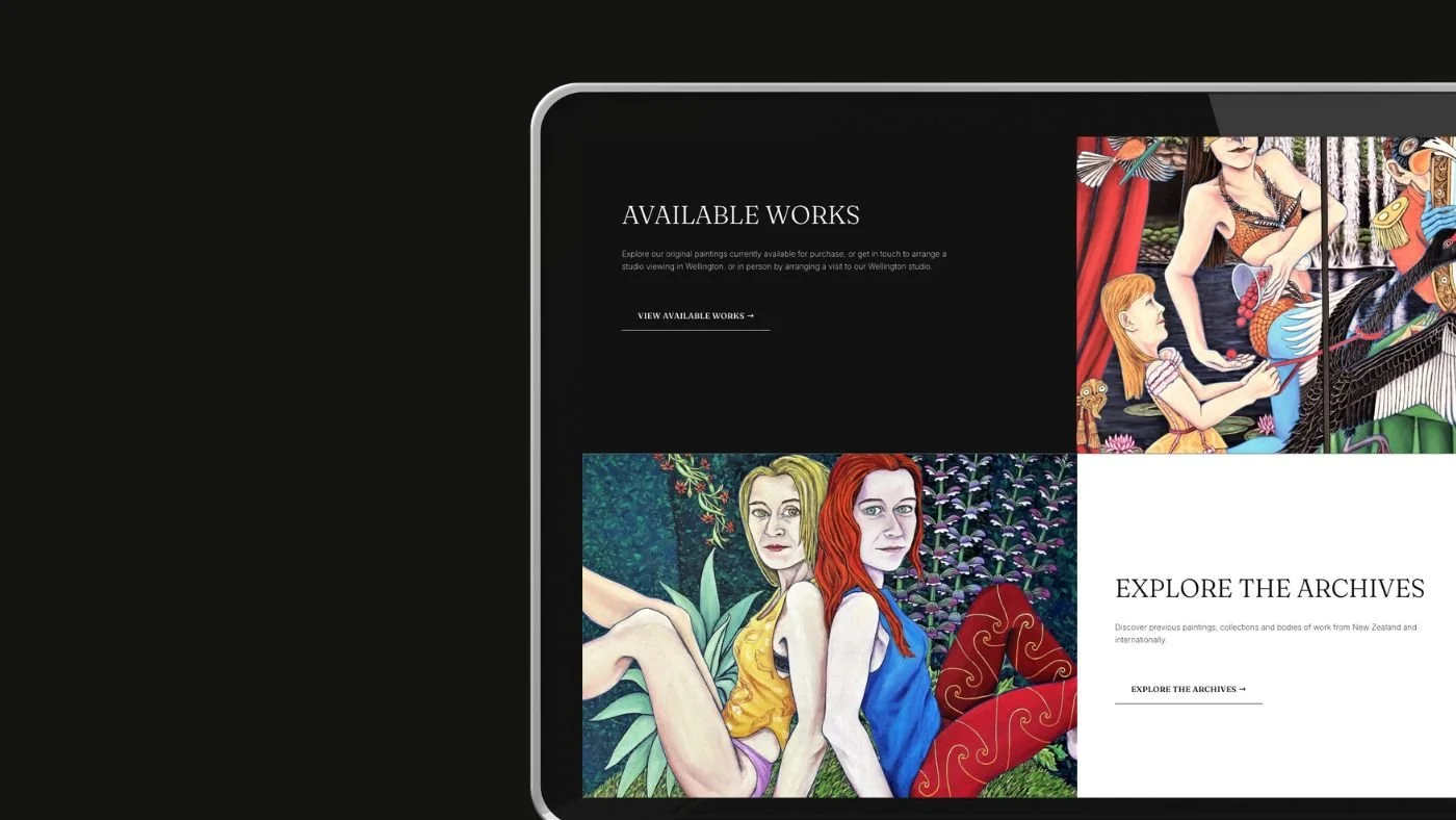
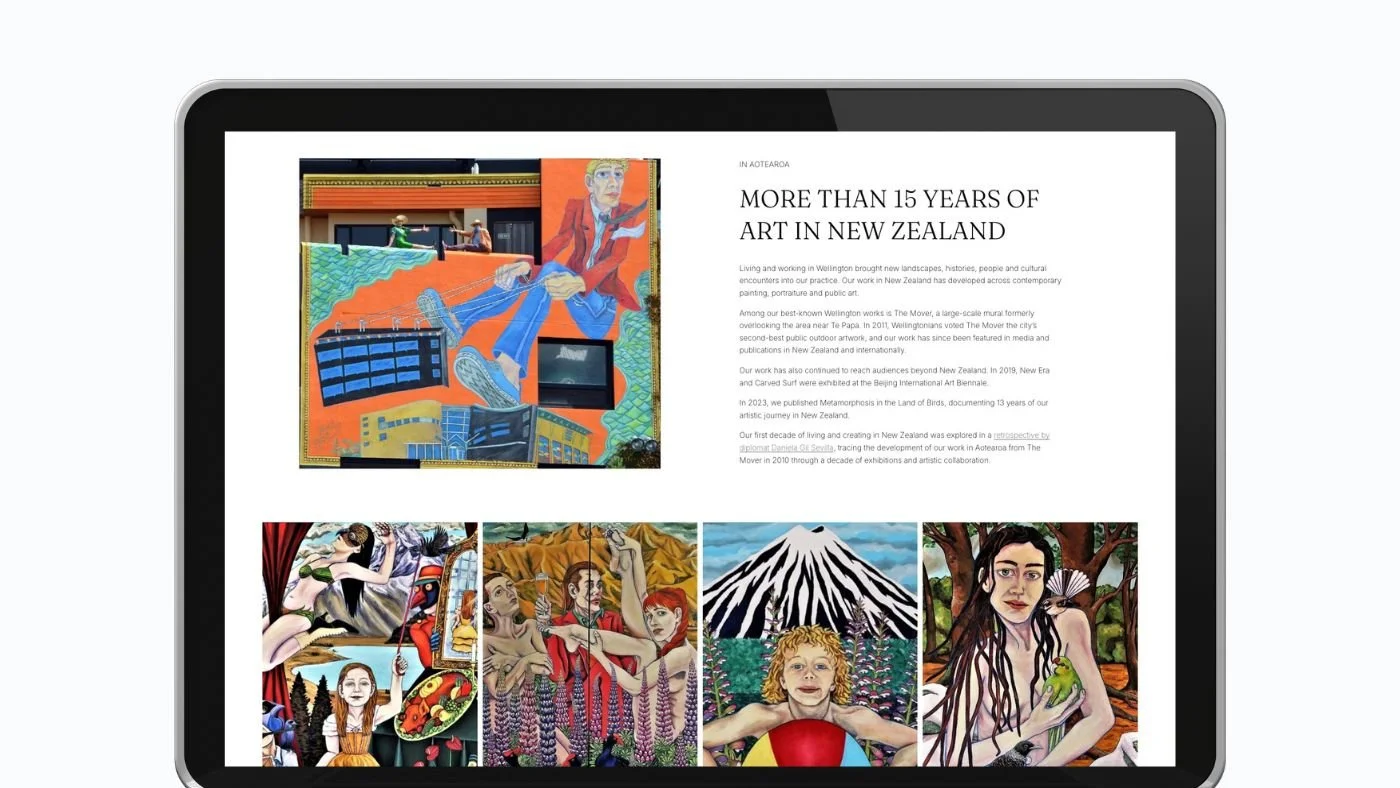
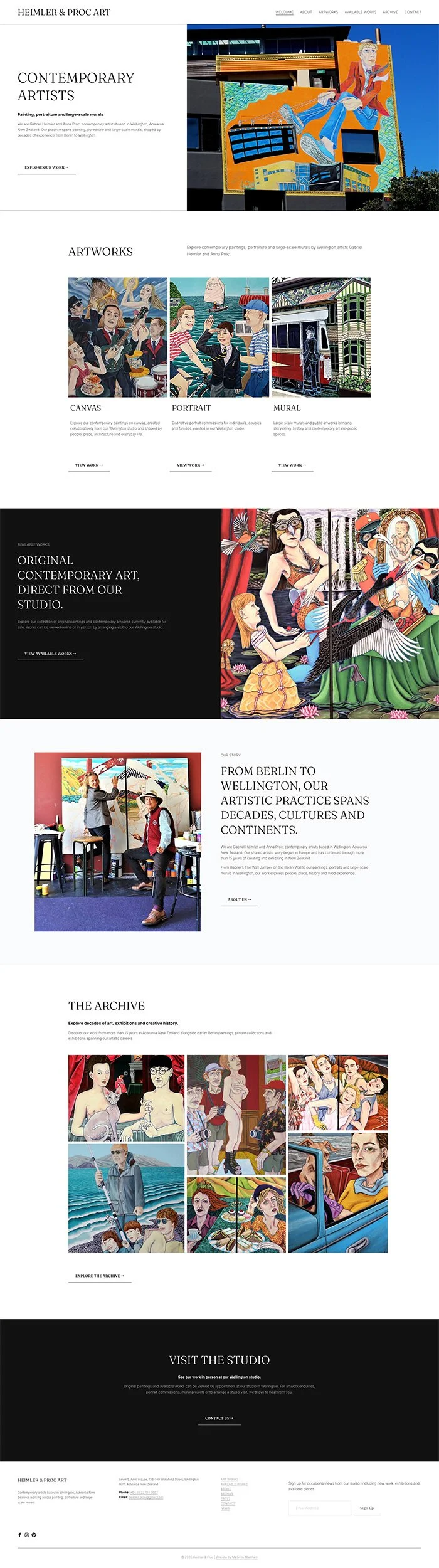
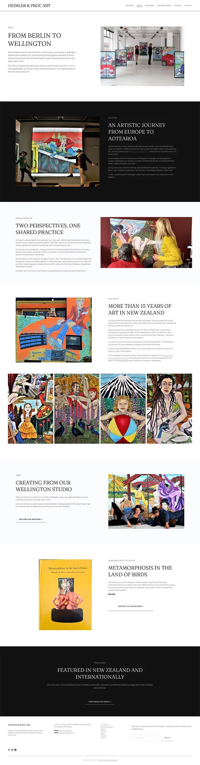
From there, I created a much clearer website structure that guides visitors through their work rather than expecting them to already understand it. Murals and major projects were organised properly, their extensive back catalogue was given a logical archive, and key areas such as exhibitions, available works, private collections and press became much easier to find and explore.
The redesign gave the artwork much more room to breathe too. Instead of navigating through layers of menus and disconnected pages, visitors can now move naturally through Anna and Gabriel’s work and get a much better sense of the breadth of their practice.
There was plenty of work behind the scenes as well. Restructuring a website that has existed for years means you can’t simply delete old pages and start again. Existing URLs may already appear in Google or be linked to elsewhere online, so I created 301 redirects to send old URLs to the most relevant new pages rather than leaving visitors with broken links.
Once the website was finished, Anna and Gabriel wanted to manage ongoing updates themselves. I created more than an hour of bespoke video tutorials showing them how to make the specific changes their website needs, from adding new work to updating galleries and pages, while maintaining the new structure.
The result is a website that still contains the depth, history and personality of Heimler & Proc’s work, but makes that body of work much easier to understand and explore. Rather than simply redesigning what was already there, the project involved understanding years of creative work and finding a way to translate it into a clear, considered online experience.
Words from the client
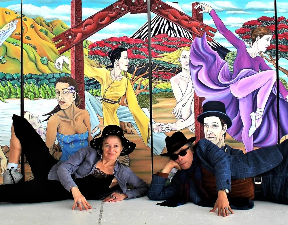
“We are so happy with our new website!”
ANNA PROC
Colour Palette
Like what you see?
If you like this website design then let’s chat about how I made it happen.