Sometimes the Best Thing I Can Do to Your Website Is Delete Stuff

When I first look through a client’s existing website, I can usually spot a few things within the first five minutes that are making life harder than they need to be.
With Heimler & Proc’s website, there were quite a few.
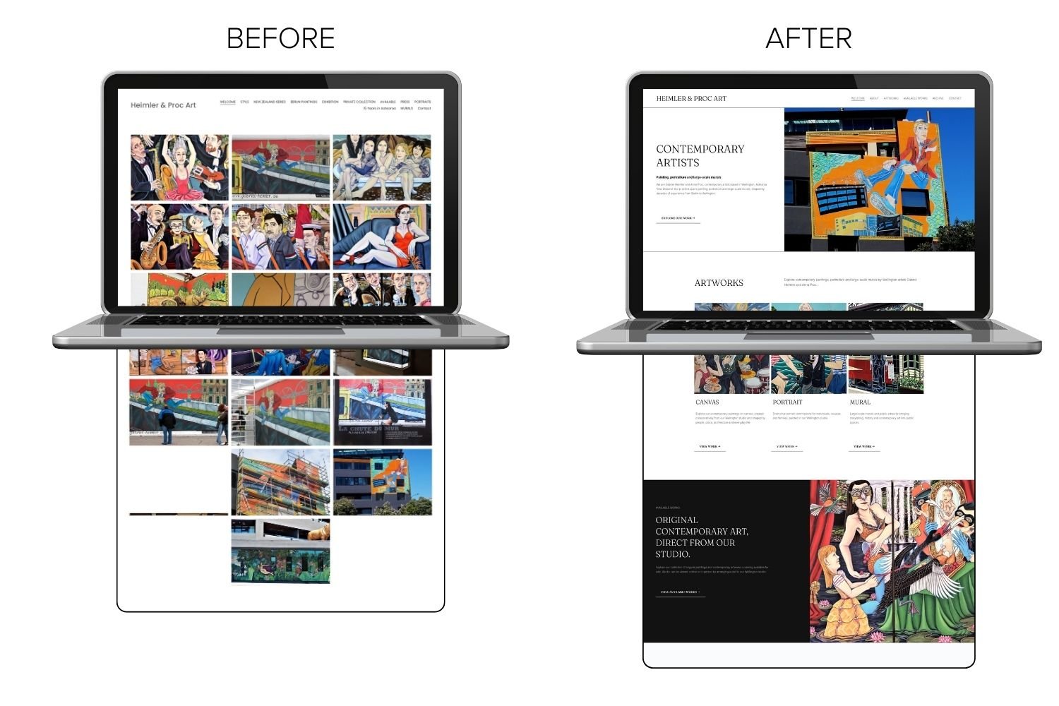
There were huge dropdown menus leading to lots and lots of individual pages, some containing little more than a single image. Years of artwork and projects had been added to the website over time, but there wasn’t really a journey through any of it.
And then there were the URLs.
My personal favourite?
/page-84
😂
The website didn’t need more.
It needed someone to work out what should stay, what could go, what belonged together and, most importantly, how someone should actually move through it.
Websites Have a Habit of Growing
This is something I see quite often with established businesses.
A website starts off perfectly manageable. Then there’s a new project, service, exhibition or piece of press, so another page gets added. Then something else comes along and another link appears in the navigation.
Nothing is particularly wrong with any individual decision. But do that for years and eventually you can end up with a website that has grown without anyone stepping back and looking at the structure as a whole.
And that’s essentially what had happened with Heimler & Proc.
Anna Proc and Gabriel Heimler are internationally recognised artists with decades of artwork, exhibitions, murals and projects behind them. Their website had accumulated a huge amount of that history over the years.
You can see the full Heimler & Proc website project and the finished result in my portfolio here.
They’re experts at what they do.
They have absolutely no reason to also be experts in website UX, navigation structures, URL slugs or what on earth a 301 redirect is.
That’s my job.
Your Navigation Isn’t a Filing Cabinet
One of the first things I noticed was just how much was sitting in the navigation.
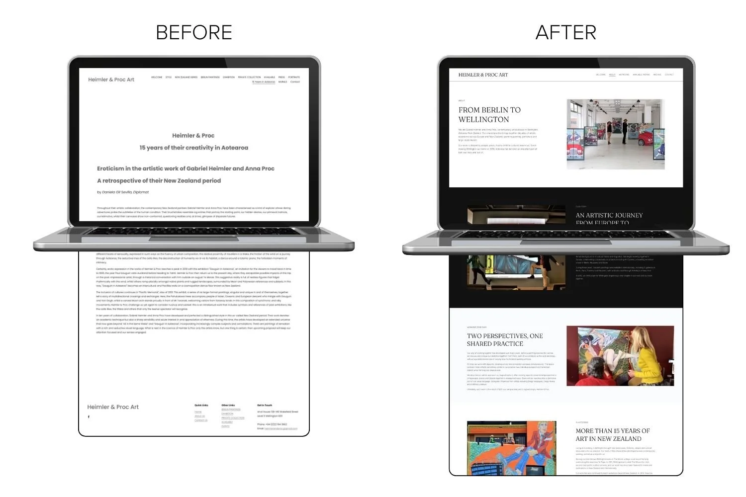
There were dropdowns containing more dropdowns, leading to individual pages for pieces of work and projects. In some cases, you’d click through to a page and find little more than a single image.
Technically, the information was there.
But that doesn’t necessarily mean it was easy to explore.
Your website navigation isn’t supposed to be an index of everything that exists on your website. Its job is to help someone understand where they are and where they should go next.
So rather than simply recreating the existing structure in a prettier new design, I started looking at the content differently.
What belonged together?
What deserved its own page?
What could be part of a gallery?
What should live in the archive?
What new landing pages were needed at the top-menu level to bring related work together and give visitors a clear place to start?
And what were the main things somebody visiting the website was actually likely to want to explore?
That became the basis of the new structure.
Instead of the navigation trying to take visitors directly to every individual piece of content, new landing pages could introduce a collection of work and then let the visitor choose where they wanted to go next.
Rather than presenting someone with a giant list of destinations before they’d even started, we created a journey through the website.
Not Every Page Deserves to Survive a Website Rebuild
This is where deleting stuff comes in.
There’s sometimes an assumption that when you rebuild a website, everything from the old site needs to be faithfully recreated somewhere on the new one.
It doesn’t.
Sometimes improving a website means adding something that’s missing. Sometimes it means rewriting something that isn’t clear. Sometimes several thin pages would be far more useful as one gallery.
And sometimes it means looking at a giant navigation menu and thinking, right, we definitely don’t need all of these.
With Heimler & Proc, there was a huge amount of valuable work on the website. The answer wasn’t to throw away their history. It was to give that history a better home.
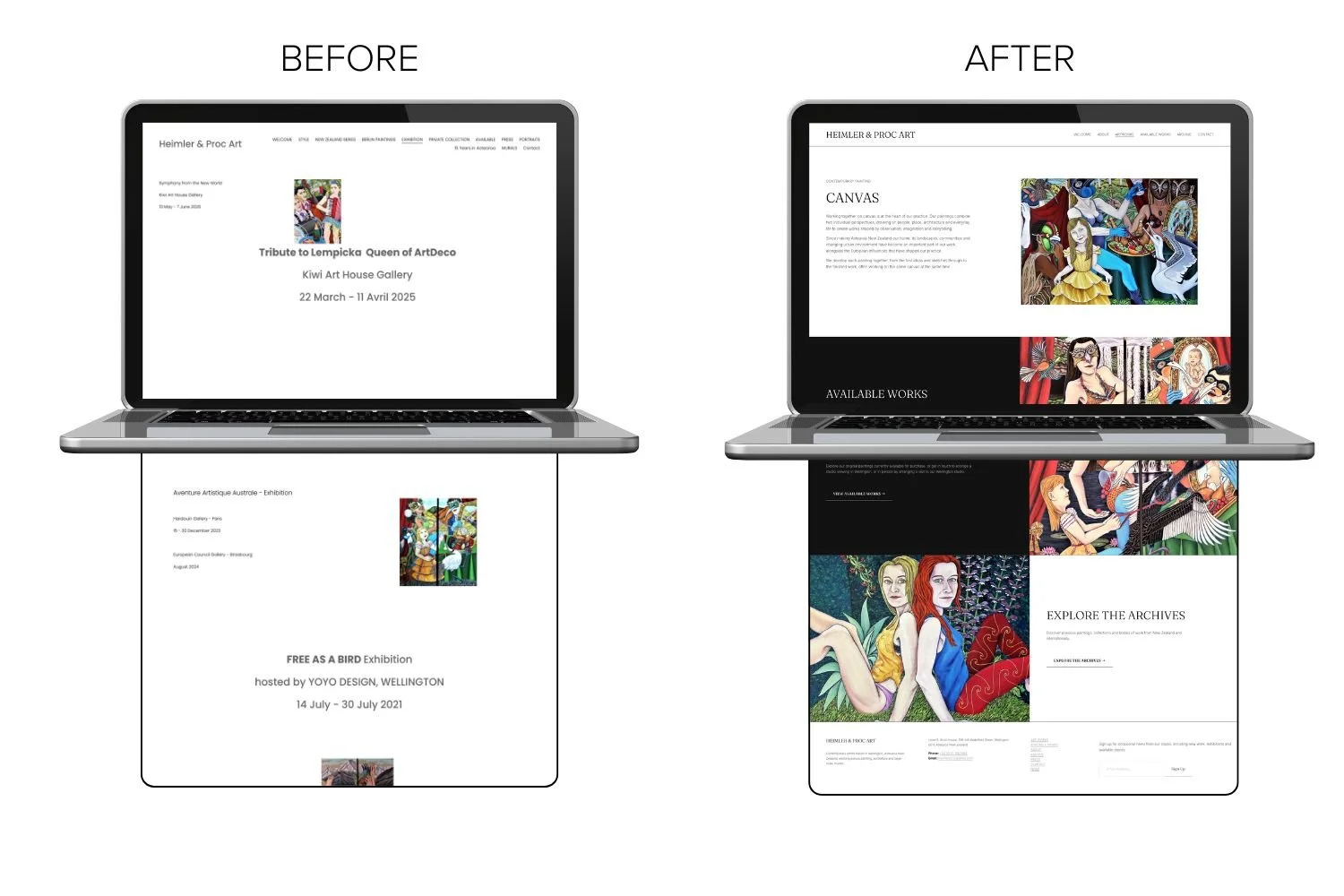
Individual pieces could sit together in galleries. Related projects could be grouped. Older work could be organised into a proper archive. Important projects could still have the space they deserved without every single thing needing its own link in the main navigation.
The goal wasn’t to make the website smaller for the sake of it. Heimler & Proc have an enormous body of work that deserves to be there.
The goal was to make all of that work easier to explore.
And Then There Were the URLs…
Over the years, pages get created, duplicated, renamed and moved around. Platforms generate URLs automatically and, unless somebody deliberately changes them, they can stay that way indefinitely.
Which is how you end up with:
/page-84
It probably made perfect sense to Squarespace at the time.
To a human being, not so much.
There were a number of strangely named URLs sitting underneath the old Heimler & Proc website, so part of rebuilding the site was cleaning those up too.
But deleting a page or changing its URL doesn’t mean simply hitting delete and forgetting it ever existed.
Google may already know about that page. Someone may have bookmarked it. Another website might be linking to it.
So when I removed, combined or renamed pages, I mapped the relevant old URLs to their new homes using 301 redirects.
That means someone following an old link is automatically taken to the most appropriate place on the new website rather than landing on a Page Not Found screen.
It’s one of those jobs nobody really sees when a new website launches, but it’s an important part of rebuilding an established site properly.
I’ve written more about this in Changing Your Squarespace Domain? Here’s How to Protect Your SEO, so if you’re particularly interested in 301 redirects, you can read more about them there.
Creating a Journey Through the Work
The finished website still contains an enormous amount of Heimler & Proc’s work.
It just doesn’t feel like it.
There’s now a much clearer structure around their portraits, murals, available works, private collection, exhibitions and archive. Someone can discover the artists, explore their work and naturally move deeper into the areas they’re interested in.
The landing pages are an important part of that.
A good landing page acts a little like a signpost. It says, here’s what you’ll find in this part of the website, and here are the different directions you can go from here.
That means the main navigation can stay simpler while the website itself can still contain a huge amount of content.
That’s UX in its simplest form.
You shouldn’t have to stop every few seconds and think, where am I supposed to go now?
The website should keep answering that question for you.
You can see the finished Heimler & Proc website and read more about the project in my portfolio.
And Then I Had to Hand It Back
There was one more important part of this project.
Anna and Gabriel wanted to be able to manage the website themselves once I’d finished.
And I absolutely wanted them to be able to do that.
But after spending all that time simplifying the structure and creating a much clearer journey through the website, the last thing I wanted to do was hand it back and expect them to magically know how I’d built everything.
So I created more than an hour of personalised training videos specifically for their website.
Not generic Squarespace tutorials.
Videos showing them exactly how to make the updates they’re actually likely to need. How to add new artwork, update existing pages, work with the galleries, keep things consistent and understand where different types of content belong.
And, importantly, which parts of the structure are probably best left alone.
Because making a website easy for the client to manage is part of the job too.
My aim isn’t to build something that only I know how to use, so you’re forced to come back to me every time you want to change an image or add something new.
I want my clients to own their websites and feel confident managing the everyday stuff themselves.
And I’m always here when something bigger needs changing or they simply don’t want to do it themselves.
Hopefully, with a little guidance on how everything fits together, we won’t find ourselves back at /page-184 in another ten years.
Has Your Website Grown a Bit Out of Control?
If your website has been added to, changed, tweaked and patched together over the years, you’re definitely not alone.
And you don’t necessarily need to throw everything away and start again.
Sometimes you just need someone to look at it with fresh eyes, work out what’s worth keeping, simplify what’s become complicated and give everything a proper home.
Sometimes that means creating something new.
Sometimes it means restructuring what’s already there.
And sometimes the best thing I can do to your website really is delete stuff.
If you’re not sure what your website needs, get in touch and let me have a look.